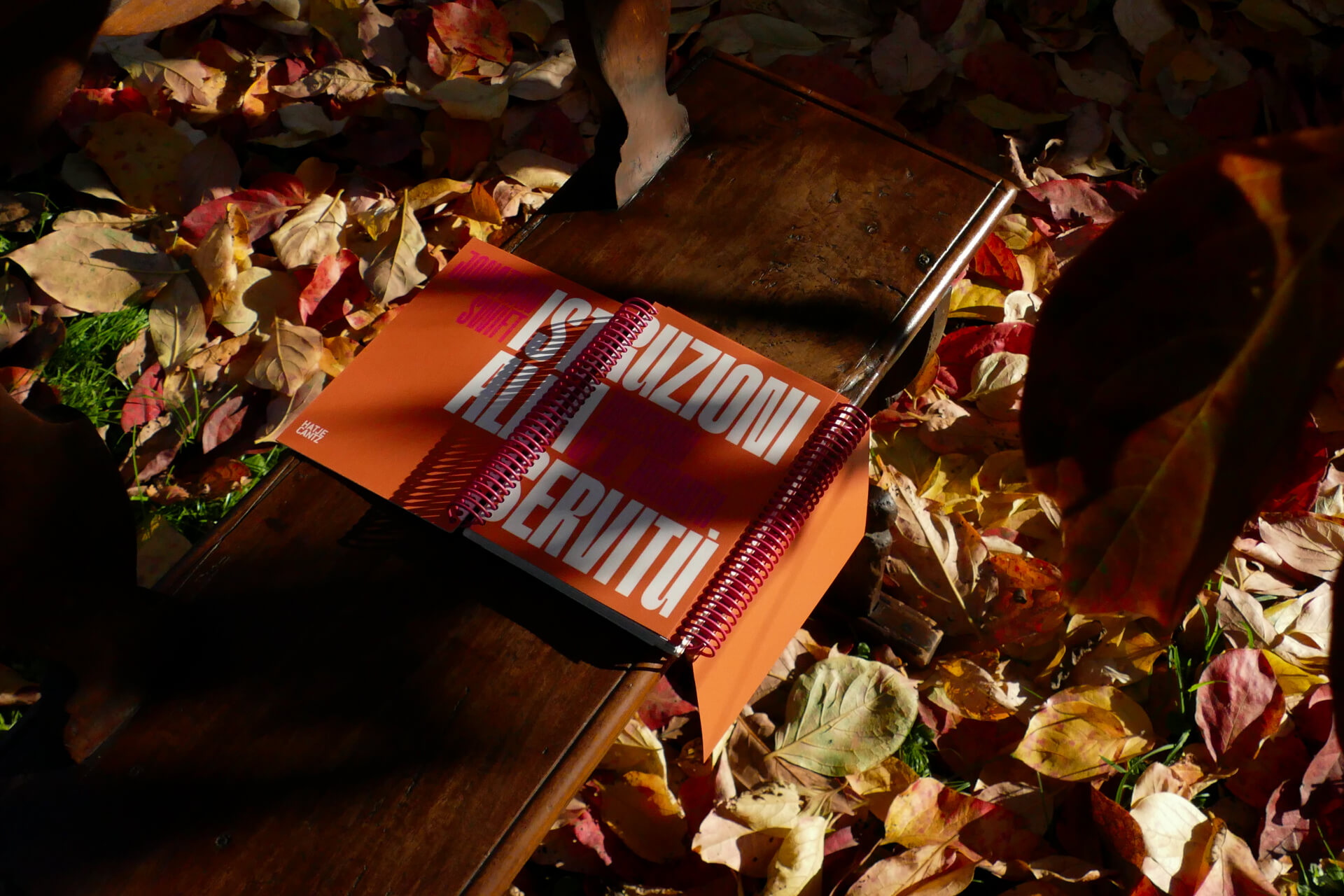
Istruzioni alla servitù
The project focused on reinterpreting Directions to Servants by Jonathan Swift, an 18th-century manual that humorously subverts power dynamics. The new design features two interconnected volumes, with William Hogarth’s satirical artworks accompanying the text to reflect the social and moral context of the era.
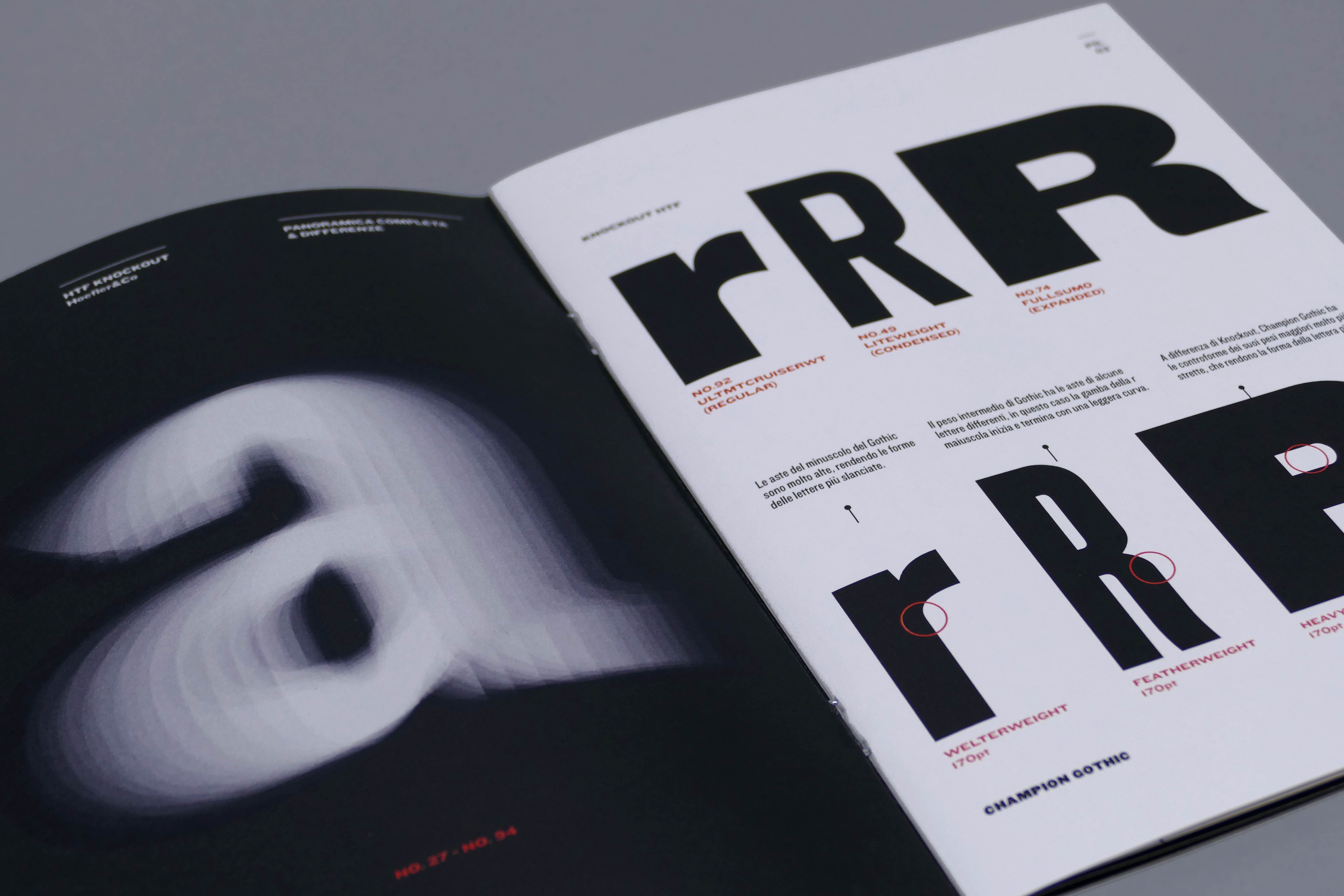
knockout
The printed work presents a study of the typeface’s main characteristics, the construction of the glyphs, and the general rules that ensure consistency across the entire alphabet.
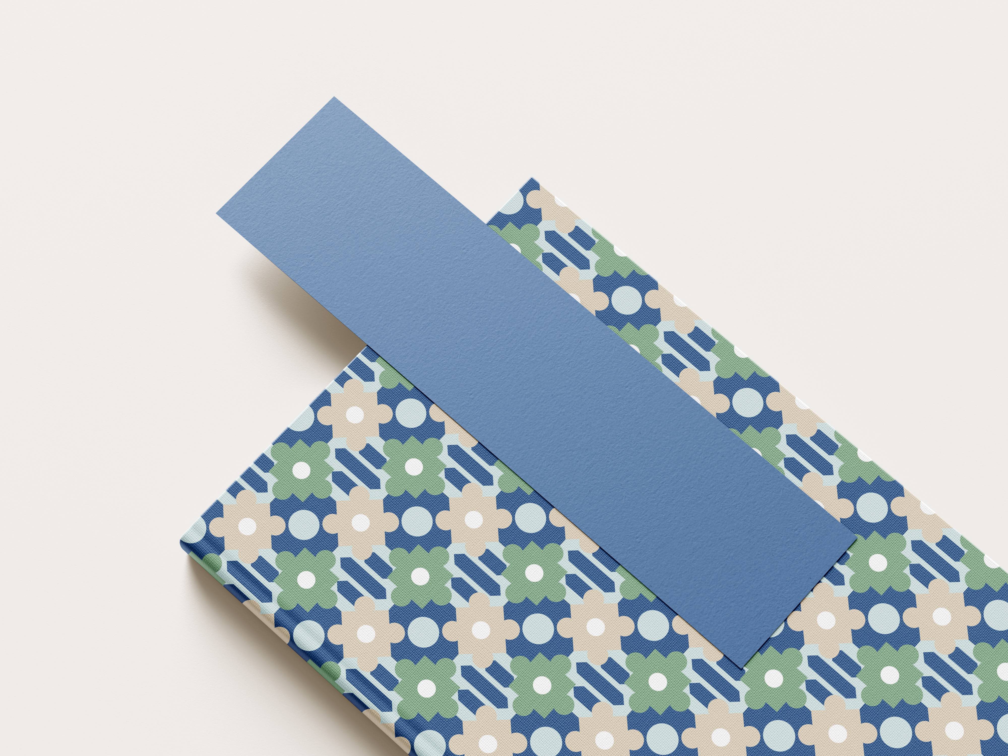
Antica Modernità
A design workshop exploring Gio Ponti’s work to create contemporary patterns for the “PdiPigna” line by Cartiere Paolo Pigna.
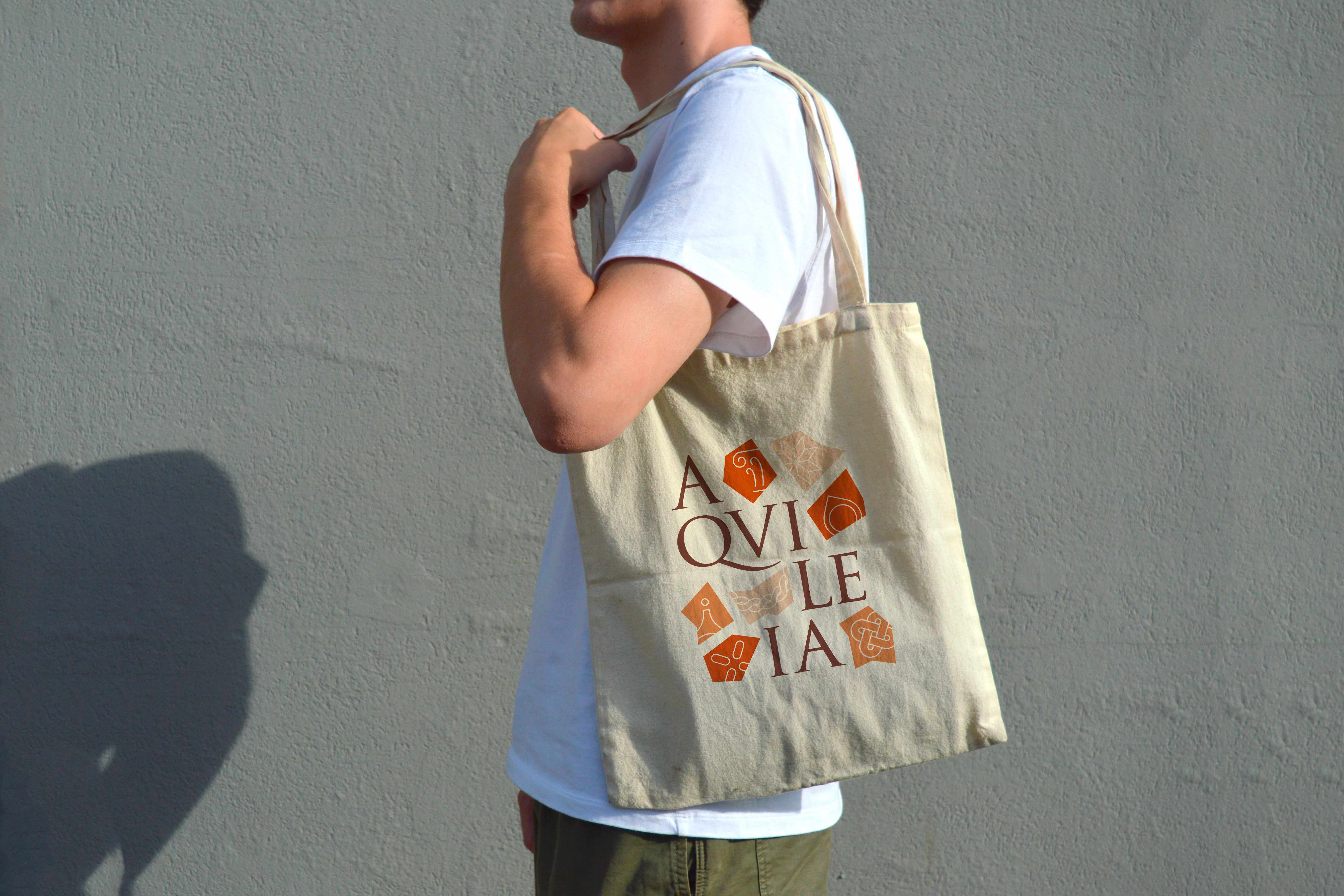
Aquileia
Fictitious development of a coordinated image project for the UNESCO site “Archaeological Area of Aquileia and Patriarchal Basilica.”
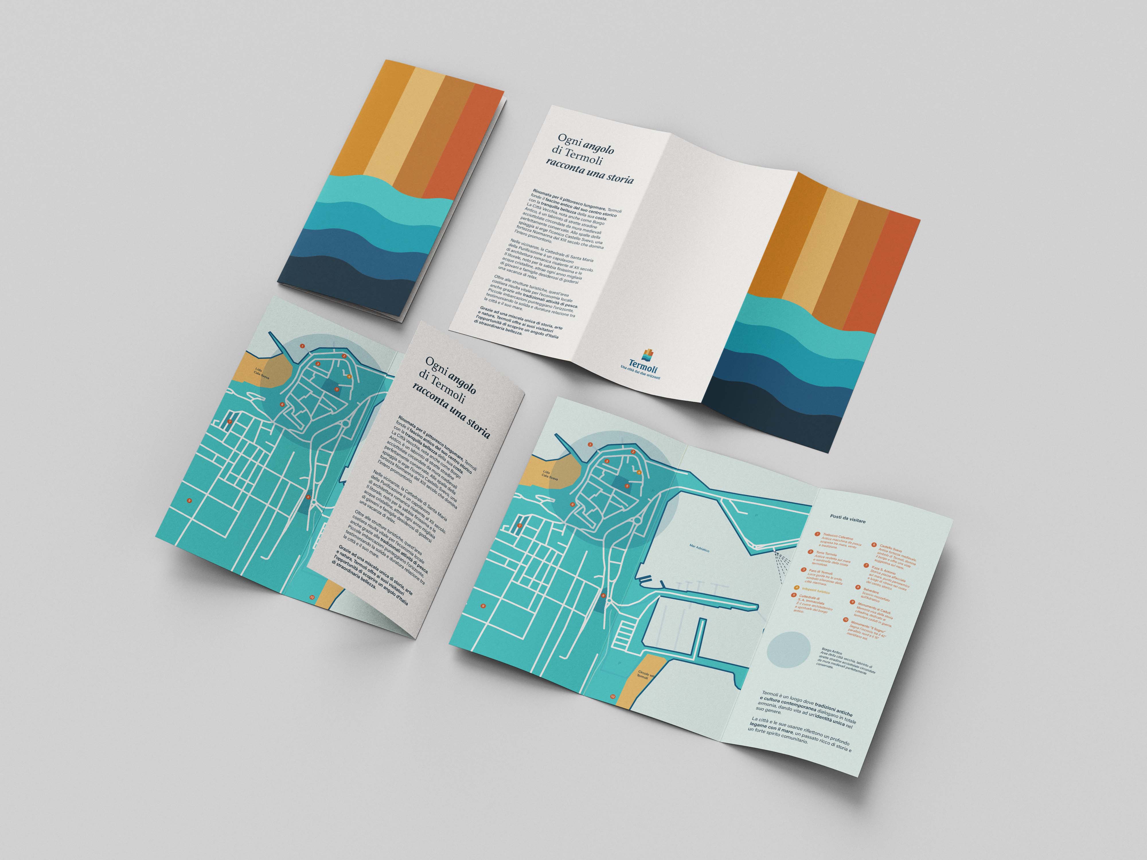
Rebranding Termoli
The rebranding of Termoli draws on two key elements of the city’s identity: the sea and the Swabian Castle. From the symbol beside the logotype, two graphic elements were extracted as distinctive, recurring motifs within a visual system that uses Seagull for the logo, Athelas for campaign titles, and Acumin for longer texts.
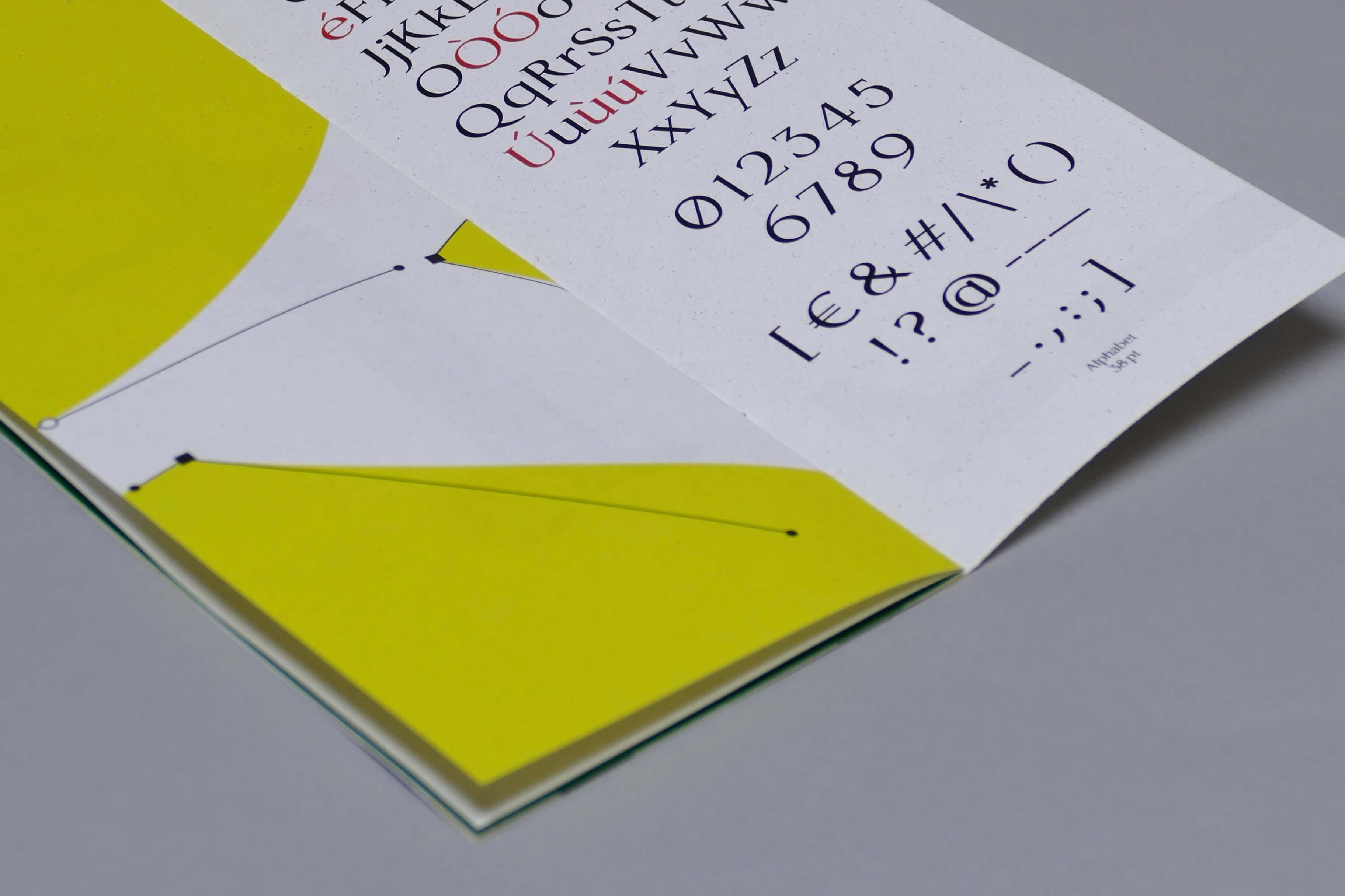
Senzanome
The project aimed to create a font display starting from the study and analysis of an entire - or part - alphabet chosen in the Monumental cemetery in Milan. The brief had as final output the creation of a typographic specimen that told the characteristics of the font and showed the available glyphs.
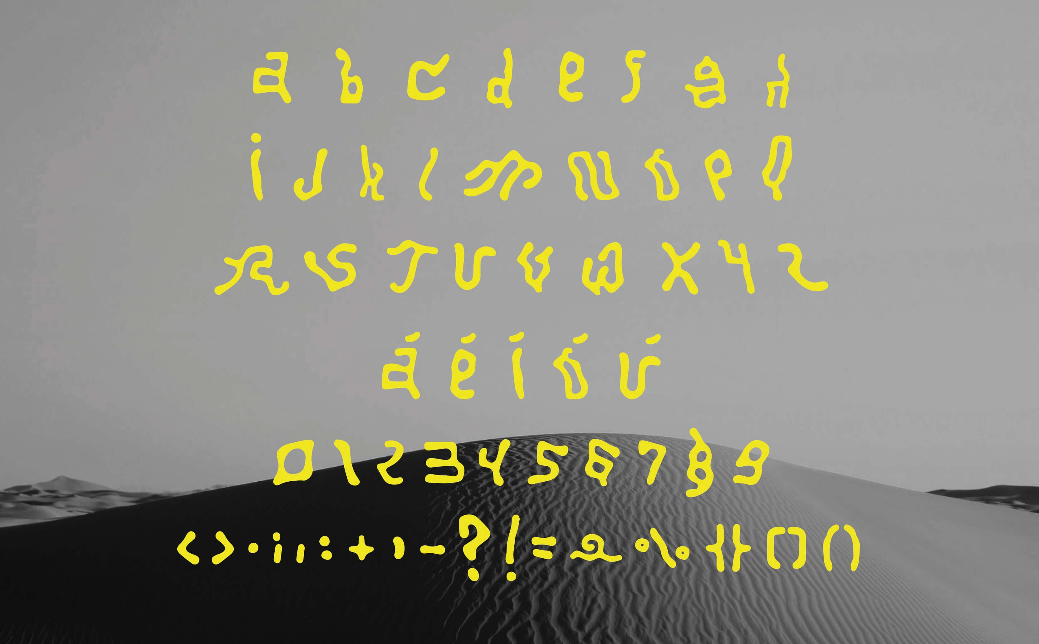
AAAlfabeto
The project brief required creating a display font based on the theme “order and disorder.” Two typefaces were developed: the first draws inspiration from Martin Venezky’s distinctive textures and Turing’s equations, which digitally recreate natural patterns; the second explores the concept of letters gradually fading away.